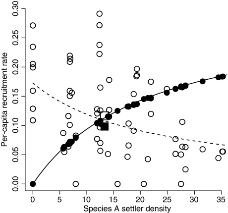
Figure 6.
The per-capita recruitment rate of species A (solid symbols and curve) and species B (open symbols and dashed curve), as a function of species A settler density, when species B is rare. This is a snapshot in time, with the variation being across space. The circles represent each patch in a simulation of the spatially explicit model, and the curves are the predicted values of actual (species A) and expected (species B) recruitment rates in the spatially implicit model (see Appendix S1). The squares mark the mean settler density and recruitment rates in the spatially explicit model, revealing that the nonlinearities in the recruitment curves cause settlement variability to reduce the mean recruitment rate of species A and increase the mean recruitment rate of species B. All parameters as in Fig. 2.

