
Figure 4. SAM plotsheets.
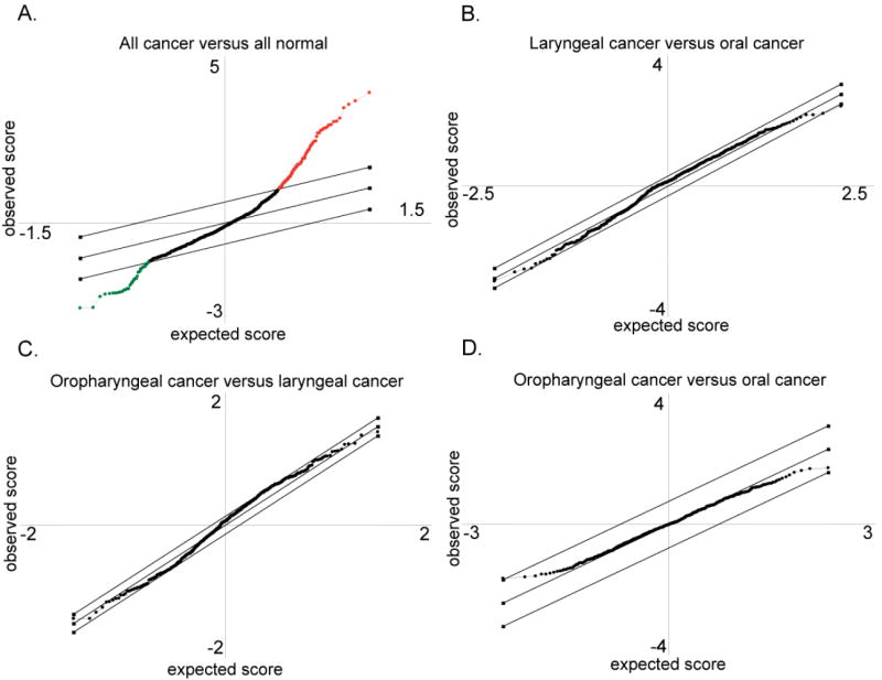
These panels depict the graphical representation of the SAM analysis. The diagonal lines delineate the bounds for normal variation. Circles that are outside the lines represent proteins that are differentially expressed between samples, with either increased abundance in normal (red), or increased abundance in cancer (green), as in panel A, a comparison of normal and cancer. Circles within the lines represent proteins that are not significantly different in the comparison, as in panels B, C, and D, representing the comparisons between laryngeal versus oral cancer, oropharyngeal versus laryngeal cancer, and oropharyngeal versus oral cancer, respectively.