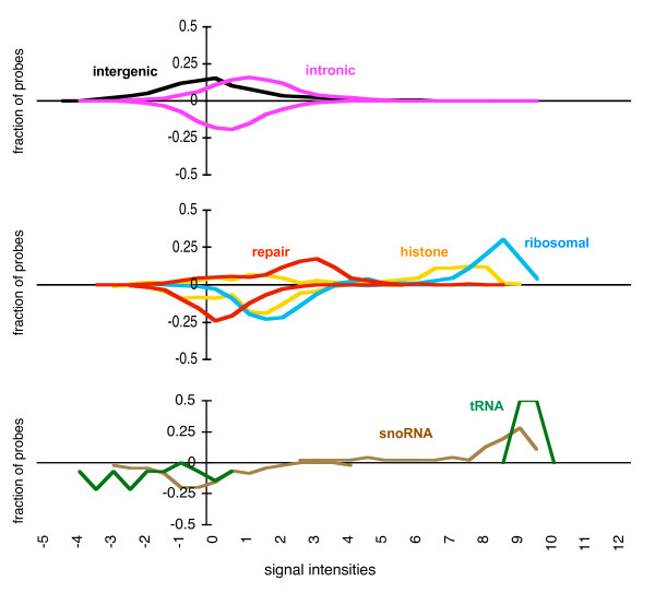
Figure 1.
HybMap signal intensities for genomic features. The distributions of signal intensities for HybMap probes mapping to different genomic features - as indicated on the figure - are shown. Probes were grouped into bins according to their signal intensities (as shown on the x-axis) and the fraction of probes belonging to each bin is shown on the y-axis. For clarity, distributions are split into three separate charts. Signal intensities are log2 normalized against a background intensity [26]. Intensities for probes mapping to the forward strand are shown above x-axes, and to the reverse strand below x-axes. The absolute numbers of probes are provided in Table 1. Signals values are shown below the bottom panel only, but are identical for all sections.

