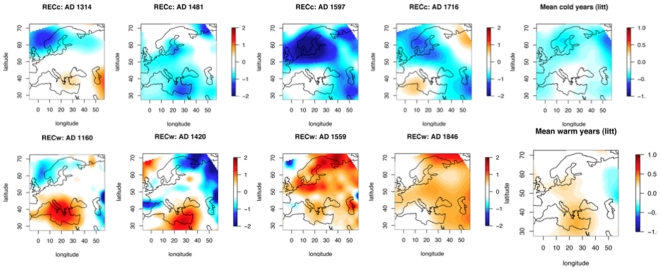
Figure 4. Extreme warm and cold years.
The upper panel represents April to September temperature anomaly reconstructions for four years known for the literature to be cold, and the middle panel represents known warm years. The lower maps are averaged maps on all the selected years pointed out in Table 2.

