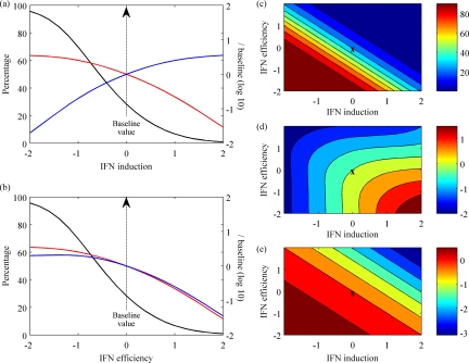
FIG. 5.
Spectrum of the immune response. (a and b) Both the total IFN produced (blue lines) and the peak virus load (red lines) were normalized to their baseline values and plotted on log base 10; cell death (black lines) is shown as a percentage. These values are all plotted against the rates of IFN induction per cell, q (a), or IFN efficiency, φ (b), both on a log scale normalized by their baseline values (average estimates from Table 2). (c to e) Contours plotted for various rates of IFN induction per cell, q, and IFN efficiency, φ, both on a log scale normalized by their baseline values (X marks the baseline values). Cell death (c) is shown as a percentage, while both total IFN produced (d) and the peak virus load (e) were normalized by baseline values and plotted on log base 10. The color scale on the right gives the values of this measure in each contour of the graph.

