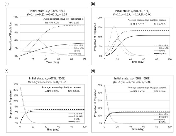
Figure 3.
Epidemic curves of infectious and dead population with and without NPI implementation. Figure 3 shows the impact of optimal control on pandemic severity, peak, and total deaths, when NPIs are triggered at different initial states. (a) compares the epidemic curves with and without NPIs, starting from a state 99% susceptible and 1% infected when β = 0.4. (b) compares the epidemic curves with and without NPIs, starting from a state 99% susceptible and 1% infected when β = 0.6. (c) compares the epidemic curves with and without NPIs, starting from a state 67% susceptible and 33% infected when β = 0.4. (d) compares the epidemic curves with and without NPIs, starting from a state 50% susceptible and 50% infected when β = 0.6.

