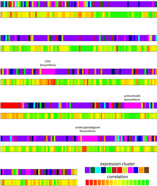
Figure 5.
Genome mapping of expression clusters and correlation between expression and predicted flux. All enzyme-coding genes are shown arranged in their order along the chromosome. The upper trace colors genes according to their membership in one of 12 expression clusters (Figure 4); genes belonging to the same cluster tend to be neighbors along the chromosome, reflecting the operon structure of the genome. The lower trace shows how strongly the predicted flux for each gene correlates with its expression. Genes from some expression clusters tend to show good correlation to the predicted flux (green), e.g. those in the central metabolism cluster (purple); mispredictions (red) seem to cluster along the chromosome and normally affect genes that are upregulated in stationary phase (pink cluster). The position of three major antibiotics biosynthesis clusters is highlighted.

