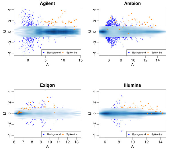
Figure 2.
MA plots: For each platform, we performed all pair-wise comparisons of the seven arrays. From each comparison we computed the log-ratio (M) and average expression value (A) for each miRNA feature. These plots show M plotted against A. To avoid drawing hundreds of points on top of each other we use a smooth scatter plot which shows the distribution of these points: dark and light shades of blue show high and low frequency of points, respectively. The points associated with spike-in transcripts with nominal fold changes of 3.16 are shown as orange triangles. Points associated with larger nominal fold changes are not shown since they were very easy to detect for all platforms. Points not associated with the spike-in transcripts (should have M = 0) that achieved fold changes above 2 are shown as large blue squares.

