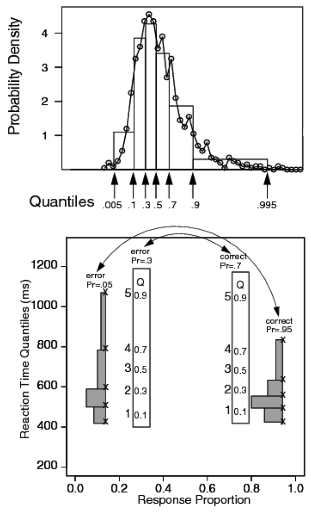
Figure 2.
The top panel shows a RT distribution as a frequency polygon, along with a quantile RT distribution with equal area rectangles drawn between the .1, .3, .5, .7, and .9 quantile RTs and rectangles with half the area outside the .1 and .9 quantile RTs. The bottom panel shows a quantile probability plot with the proportion of responses for that condition on the x-axis and quantile RTs plotted as x’s on the y-axis (x’s on the outermost pair, and digits on the innermost pair, with 1=.1 quantile RT, 2=.3 quantile RT, 3=.5 quantile RT, 4=.5 quantile RT, and 5=.9 quantile RT). Equal areas rectangles are drawn between two of the sets of the quantiles to illustrate how to interpret RT distribution shape in the plot (these are comparable to the distribution in the top panel). Two conditions are shown, one with accuracy at .95 with the error proportion .05 and the other with accuracy .7 with the error proportion .3. The correct/ error relationship is illustrated by double ended arrows pointing to the pairs. In the plots of data, digit alone are used to present values of the quantile RTs.

