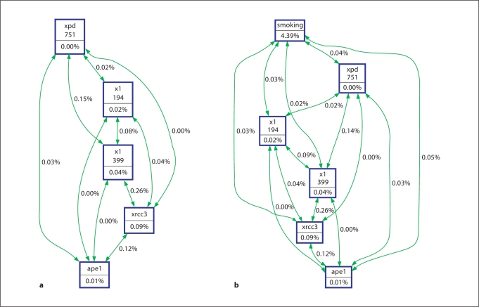
Fig. 1.
Hierarchical interaction graph of genotypes. The percentage of entropy removed (i.e. information gain) by each variable is visualized for each node (box). The percentage of entropy removed for each pairwise Cartesian product of variables is visualized for each connection. A positive entropy (plotted in green) indicates interaction while a negative entropy (plotted in red) indicates redundancy. a Overall analysis of genotype. b Analysis of genotype and smoking status.

