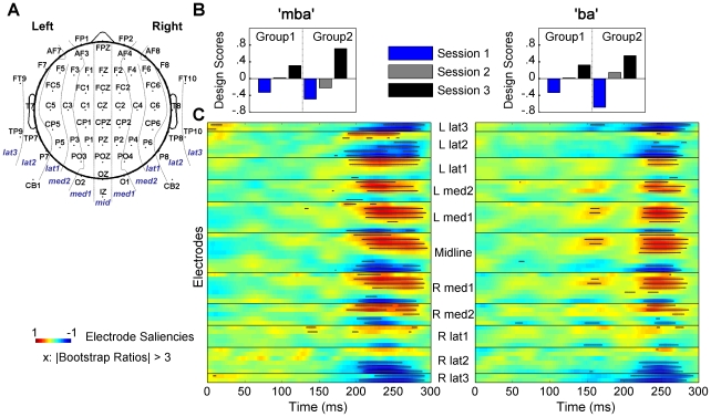
Figure 3. Results from Mean-Centering PLS analyses.
(A) Electrode Montage. To report PLS results, Electrode locations were classified into 11 sagittal layers indicated by the dotted lines: three lateral (lat1–3), two medial layers (med1–2) in the two hemispheres, and one midline layer (mid). (B) Contrast weights identified for the first significant LV. For each stimulus type, the largest difference was observed between Sessions 1 and 3, in the P2 latency range, for both groups, but the degree of difference was greater in Group 2. (C) Spatiotemporal patterns of electrode saliencies and bootstrap results corresponding to the design LV shown in (B). The x-axis represents time in milliseconds (ms) starting at the stimulus onset marked as 0 ms. The y-axis represents electrodes organized in 11 blocks corresponding to the 11 sagittal layers in the montage shown in (A). Within each block, electrodes are ordered from top to bottom representing anterior to posterior sites. Each horizontal color bar represents temporal patterns of the electrode saliencies for a given electrode. Warm (more red) color illustrates time points with positive differences expressed in the design contrasts; cool (more blue) color expresses those of negative. Positive saliencies (warm color), and negative saliencies (cool color) indicate time points at which the amplitude of the AEP was enhanced over three experimental sessions. Saliencies are scaled with the singular value. For each electrode, horizontal black bars (comprised of individual “x”s) are plotted over the color contrasts to identify the time points at which differences expressed in the contrasts were stable across participants (bootstrap ratios >3).

