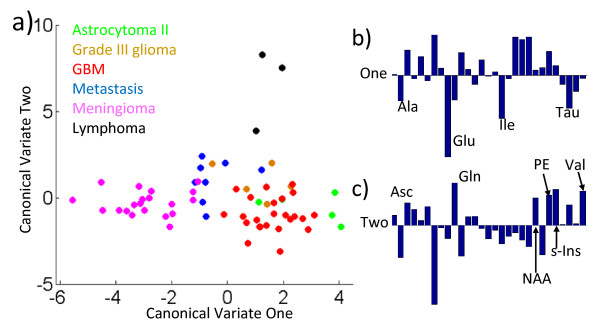
Figure 6.
MANOVA analysis of normalised metabolite concentrations. a) Scatter plot of the first two canonical variables of the MANOVA analysis of the 6 different tumour types. Each individual sample is plotted with a colour particular to its tumour type as indicated in the key. b) The relative contributions of the normalised amount of metabolite that form Canonical Variate One are expressed as a bar chart. The most significant negative contributions in the linear combination are labelled with the metabolite abbreviation. c) The bar chart showing the combination that forms Canonical Variate Two. Here the largest positive contributing metabolites are labelled.

