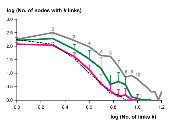
Figure 3.
Frequency distributions of connectivities. Double-logarithmic plot of the frequency distributions of connectivities by node (metabolite). The parasites are shown in red (n = 8), the non-parasites in green (n = 8), error bars indicate standard deviation. Grey line, reference network; dashed line, average of randomly shrunk networks (n = 10).

