Figure.
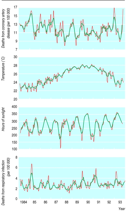
Seasonal variation in death rate from coronary artery disease, average temperature, death rate from respiratory infection, and hours of sunlight by month 1984-93. Grey lines represent monthly rates and black lines three month moving averages. All curves display significant annual periodicity (P<0.001)

