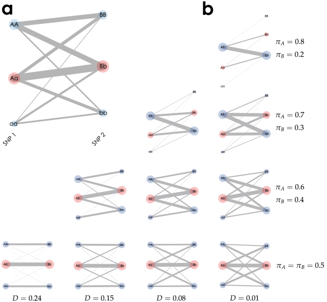
Figure 1. Textile plots of simulated two SNP genotype data.
(a) The plot corresponds to the  contingency table (Table 1) whose marginal genotype counts are shown by each circle with area which is proportional to the number of replicates, and each pairwise count of the two genotypes is shown by the width of a segment connecting two genotypes. (b) The column indicates the difference of the covariance
  and the row indicates different pair of allele frequencies
  . The greater the grade of the line crossings between two SNPs, the weaker the covariance between the SNPs. We also see that the steeper the slope between heterozygotes, the greater the allele frequency difference between A and B.

