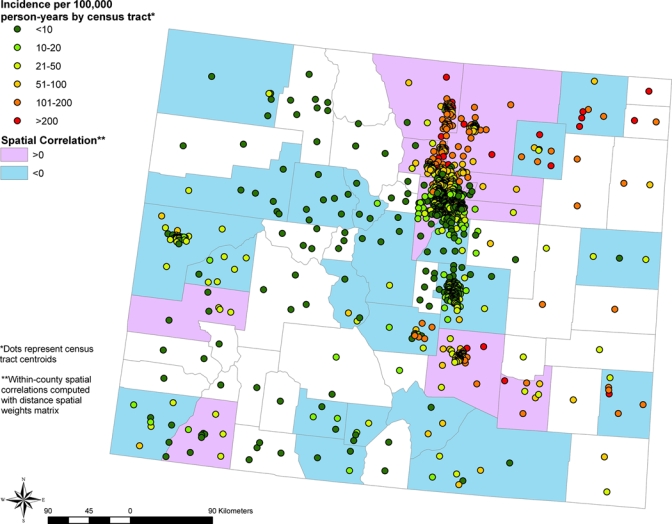
Figure 3.

Spatial correlation of West Nile virus disease incidence among census tracts within a given county based on combined data for 2003 and 2007. Colorado counties with positive spatial correlation among census tracts are shown in purple, counties with negative spatial correlation among census tracts in light blue, and counties containing too few census tracts to calculate spatial correlation in white. Points indicate locations of census tract centroids and are color coded by West Nile virus disease incidence. This figure appears in color at www.ajtmh.org.
