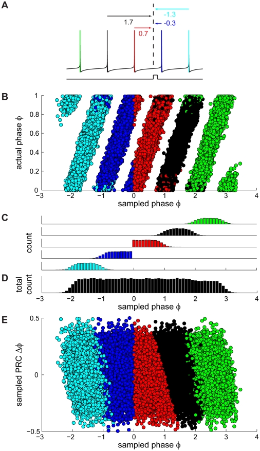
Figure 3. A new approach for generating corrected PRCs.
(A) Schematic illustration of a spike train, coded by color: the red spike is immediately preceding the pulse and is the one used as a reference ( ) in the traditional method. The remaining colors correspond to the temporal sequence of spiking (green: three spikes before pulse, black: two spikes before pulse, blue: first spike after pulse, cyan: second spike after pulse). In our new approach, all spikes are used as a reference one at a time to calculate the phase of the current pulse (values under arrows) and the corresponding PRC value. The red arrow indicates the phase used to calculate the PRC using the traditional method. (B) Sampled phase vs. actual phase plot as in Fig. 2M with the color code corresponding to the colors used in (A). The two spikes preceding the pulse (red and black circles) contribute to the interval of interest [0,1], whereas in the traditional method only the spike immediately preceding the pulse is used as a reference (red circles). (C) Phase histograms, plotted separately for the different reference spikes in the corresponding color code. (D) Phase histogram of sampled phases using all five spikes as a reference one at a time. (E) Same sampled PRC vs. sampled phase as in Fig. 2N with the same color code as in (A). PRC2 and PRC3 are calculated by using only the spikes following the pulse as reference spikes, and correspond to the phase intervals [−1,0] and [−2,−1] respectively. The data shown in Fig. 3B–E (as well as 2M,N) assume for the purpose of illustration that the process underlying spiking is perfectly periodic and that the presence of a spike does not reset this underlying process. However, when actually applying our corrected method for calculating the PRC, the phase is yoked to the reference spike, i.e. phase is reset at each reference spike.

