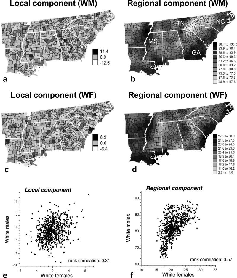
Figure 4.
Maps of the local and regional components of lung cancer mortality risk. (a and b) Top: for White males (WM), (c and d) Middle: for White females (WF). (e and f) Bottom: scatterplots portraying the relationships. The strongest correlation is observed among the regional components, which display the large-scale trend in risk for both sexes; the local component, which reflects local departures from this regional background, appears more sex specific.

