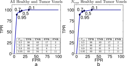
Figure 8.
(a) Average ROC curve for all healthy and tumor voxels for each of 35 test subjects. [(a), inset] Classification rates calculated using all voxels from cancerous and healthy tissue, as defined by our gold standard. Black diamonds mark TPR[Pcut] vs FPR[Pcut] values for Pcut given by the numeric labels. (b) Rates calculated only using the Nv=40 training voxels from each region in each subject. [(b), inset] Average classification rates calculated over Nv voxels. (Insets) Mean TPRs, FPRs, FNRs, and TNRs as a function of Pcut. Healthy voxels are defined as P[M]≤Pcut. Note that a low FNR is desirable for cancer diagnosis. Rates are averaged over all test subjects used in the leave-one-out protocol and given as percentages.

