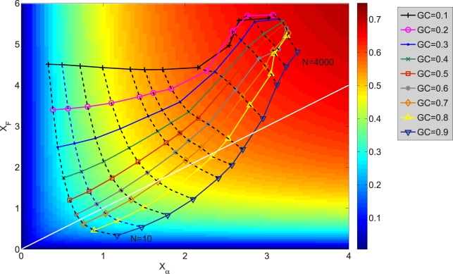
Figure 2. Mean unfolding stability  versus misfolding stability
  for neutrality exponent
  (non-neutral regime).
The sets of points joined with solid lines correspond to constant GC usage, between  (largest
  ) and
) and  (largest
  ).
).  grows and
  decreases with
  . The sets of points joined with dashed lines correspond to constant population size
  , from
  (smallest stability) to
  (largest stability). Both stability variables
  increase with
  . Data points are superimposed to a heat map of the fitness function, showing that fitness increases with
  . However, constant
  lines do not correspond to constant fitness, but there are small variations, from which the optimal GC usage is derived. The solid white line shows
  at which the selective pressures on
  and
and  balance. One can see that, at large
  ,
,  is smaller than
  for all
  , so that the selective pressure is stronger on the former.

