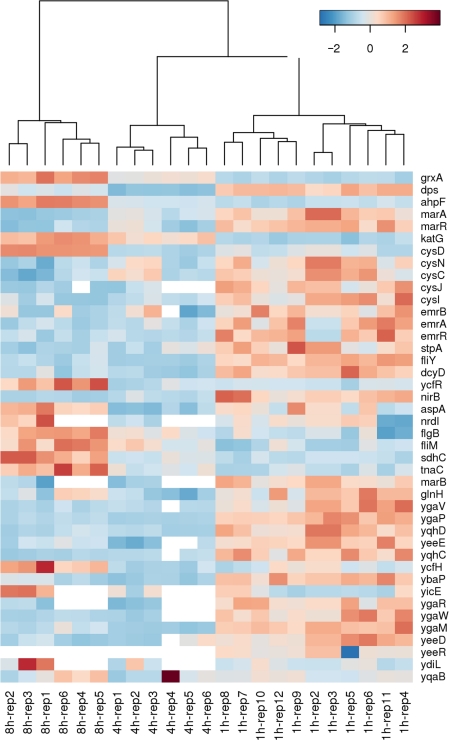
Figure 4.
Heat map generated via hierarchical clustering analysis showing differentially altered genes in a temporal manner during E. coli attachment. These genes were organized using a hierarchical clustering algorithm (Metabominer; Wishartlab) so that those which display similar expression patterns were grouped together. The hierarchical cluster analysis was performed using average agglomeration method. The heatmap was plotted with gene (row) normalized and the distance between genes were calculated based on Euclidean distance. A color bar is represented at the top of the panel with a range from −2 to 2 (blue to red), with red color representating up-regulation while blue color representing down-regulation.

