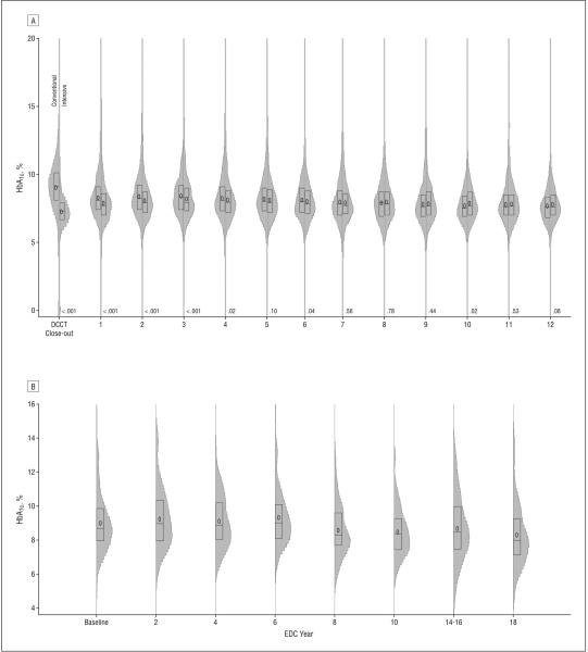
Figure 1.
Distribution of hemoglobin A1c (HbA1c) values over time in the DCCT/EDIC cohort, with intensive and conventional treatment groups shown separately (A), and the EDC cohort (B). The plot summarizes the distribution of HbA1c by study period as box plots (showing the 25th to 75th percentiles) superimposed on vertical density histograms (“violin” plots). The median of the distribution is indicated by a horizontal line and the mean by “0.” The P values on the x-axis compare the DCCT intensive and conventional treatment groups. DCCT/EDIC indicates Diabetes Control and Complications Trial/Epidemiology of Diabetes Interventions and Complications (DCCT 1983-1993 and EDIC 1994-2005); EDC, Pittsburgh Epidemiology of Diabetes Complications (1986-2006). To convert HbA1c to proportion of 1, multiply by 0.01.

