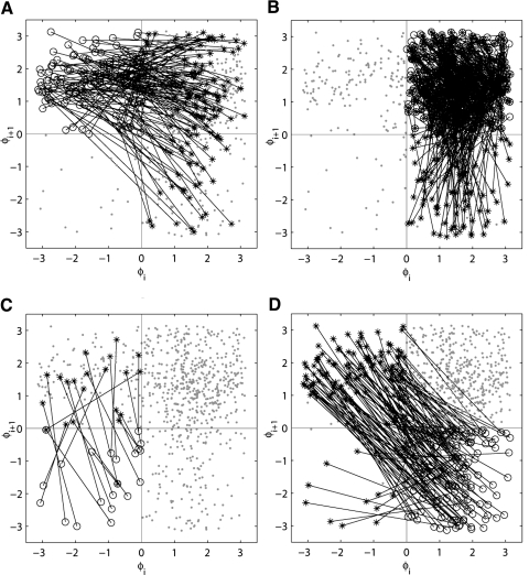
Fig. 4.
An example of the first-return map for the phases of spikes and LFP for 1 of the recorded episodes (cf. Fig. 1). All 4 first-return plots have the same data points, 4 different plots are presented to illustrate the transitions from each of the regions. In each of the plots all points in one region (A, 4th region; B, first region; C, 3rd region, and D, 2nd region) are represented by ○, the points to which they evolve in 1 cycle are represented by *, and all other points are  . Lines connect each circle to a star—the point, to which this circle evolves. Thus each plot shows the transitions from a corresponding part of the phase space. Note the high density of the circles, stars, and lines in the B; this is due to the fact that this part of the phase space (1st region) contains the synchronized state.

