An official website of the United States government
Here's how you know
Official websites use .gov
A
.gov website belongs to an official
government organization in the United States.
Secure .gov websites use HTTPS
A lock (
) or https:// means you've safely
connected to the .gov website. Share sensitive
information only on official, secure websites.

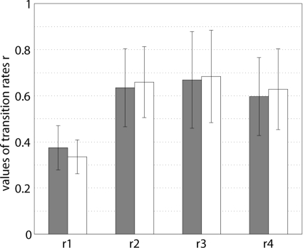
 and ◽, represent different lengths of the time window used to compute the synchronization index γ (1 s and 1.5, respectively) and thus represent the results of different inclusion criteria for the original data. Vertical lines indicate SD.