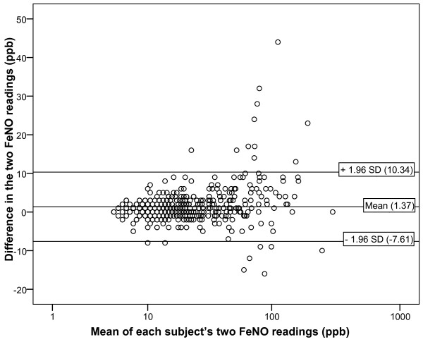
Figure 1.
Bland Altman plot showing the difference between each subject's two FeNO NIOX MINO measurements in the birth cohort. Each point represents the absolute difference between the first and second FeNO measurements for each participant versus the mean of these two measurements (n = 494). Reference lines correspond to the mean difference in two FeNO measurements taken in one individual and the 95%.

