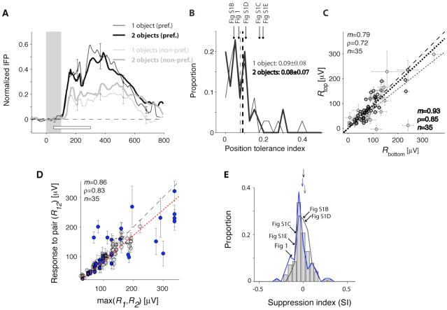
Figure 2. Comparison of the responses across positions and number of objects in the image.
A. Average normalized IFP responses to one-object images (thin lines) and two-object images (thick lines) for preferred categories (black) and non-preferred categories (gray). The responses were normalized by subtracting the baseline and dividing by the maximum response to the one-object images containing the preferred category. The white horizontal bar shows the [50;300] ms interval used to define the IFP response magnitude. This figure only included visually selective electrodes, images where the target category was absent and where we had at least 5 repetitions (24 electrodes, 35 categories, Experimental Procedures). B. The position tolerance index was defined as where Rposi is the response magnitude for the preferred category at position i (i=1,2). Distribution of the position tolerance index for one-object images (thin line) and two-object images (thick line). Bin size=0.025. The dashed line indicates the mean and the arrows denote the examples in Figure 1 and S1 (for the 2-object images). C. Comparison of the response magnitudes when the preferred category was in the top position versus the bottom position for one-object images (thin circles) and two-object images (thick circles). The dashed line is the diagonal line and the dotted line is the linear fit. D. Comparison of the responses to two-object images (R12) against the maximum of the response to the two corresponding one-object images (max(R1,R2)). To compare the responses across electrodes, we subtracted the minimum response in each electrode. The dashed line shows the diagonal line and the dotted line is the linear fit. Blue circles indicate cases where the preferred category was a human face. E. Distribution of the response suppression index, defined as . Negative (positive) values of SI indicate response suppression (enhancement) with respect to the preferred category. Gray bars include all selective electrodes; the blue curve includes those electrodes that showed enhanced responses to human faces and the gray curve includes electrodes with other preferences. The arrows denote the mean of the distributions (offset vertically for clarity). We indicate the position of the example electrodes from Fig. 1 and S1. Bin size = 0.05.

