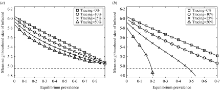
Fig. 5.
Mean neighbourhood size of infected individuals plotted against equilibrium prevalence for a range of tracing fractions, using the simulation results shown in Figures 2 and 4. (a) Single-step tracing; (b) iterative tracing. Also shown (dashed line) is the mean neighbourhood size of the population.

