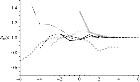
Fig. 1.
Figure showing RE/ρ from the model as more data is incorporated. The x-axis shows the distance from the week of maximum prevalence. Solid black line: 1968–1969 first wave; dashed black line: 1968–1969 second wave; dotted black line: main wave 1957; solid grey line: 1918–1919 first wave; dashed grey line: 1918–1919 second wave; dotted grey line: 1918–1919 third wave.

