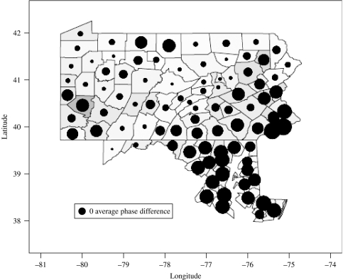
Fig. 1.
Map indicating the mean phase difference for the multi-annual variance of measles incidence in Pennsylvania. Large circles indicate counties that are on average ahead in phase of other counties in the dataset, meaning changes in incidence on average precede peaks in other counties by several months. The size of a circle indicating a zero average phase difference is shown in the bottom left-hand corner. Changes in incidence in a county with a zero average phase difference precede half of all counties and follow the remaining half. Underlying shading indicates population density with darker grey indicating counties of high population density. Coupled with population density, the map suggests that more densely populated areas are ahead in phase, suggesting epidemics originate in more populous areas.

