
Figure 1.
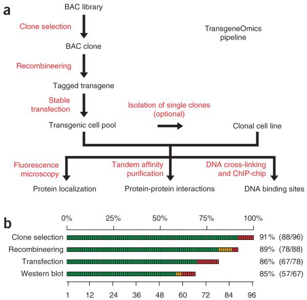
BAC TransgeneOmics pipeline. (a) Flow chart of the pipeline. (b) Efficiency of the BAC TransgeneOmics pipeline, with a summary of the efficiency of each experimental step. Green bars represent successful steps, yellow partially verified steps, red failure.