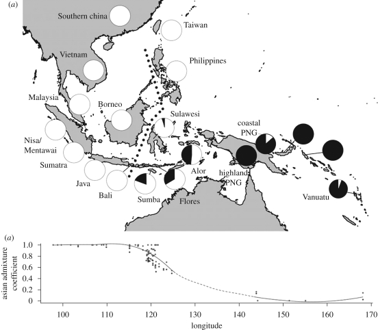
Figure 1.
Local admixture rates across the Indo-Pacific region. (a) Pie charts showing mean regional admixture rates (Asian component in white; Melanesian component in black). Wallace's biogeographic line is shown as a dotted line. Regional admixture rates are shown for data reduction purposes; admixture rates for all 60 populations (with confidence intervals) are listed in the electronic supplementary material. (b) Change in Asian admixture rates calculated from all SNPs combined (black line). Regions with no data indicated by a dashed line (exact gradient unknown). Asian admixture estimated from autosomal and X chromosomal SNPs are indicated by black and grey points, respectively. Note the decline in Asian admixture beginning in eastern Indonesia, as well as preferential retention of X chromosomal (grey) versus autosomal (black) diversity.

