
Fig. 3.
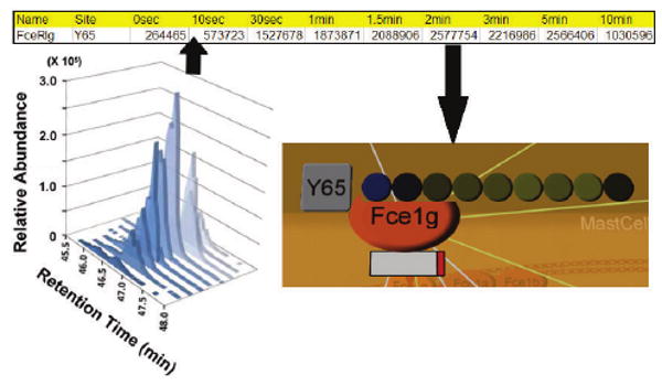
Loading and visualizing quantitative proteomic data. (a) Selected-ion chromatogram of a peptide belonging to the FceRI gamma protein. (b) Line in a file containing experimental data ready to be loaded. (c) Software display of a heatmap representing the same peptides relative abundance across the nine time points, attached to the FceRI-gamma protein. Black represents the average value for a certain peptide across all conditions, blue corresponds to a below-average abundance and yellow to an above-average abundance. The intensity of the color corresponds to the magnitude of the fold change across all peptides: the most intense yellow and blue represent the single peptide that changes the most across all peptides. Missing values would be indicated in white.