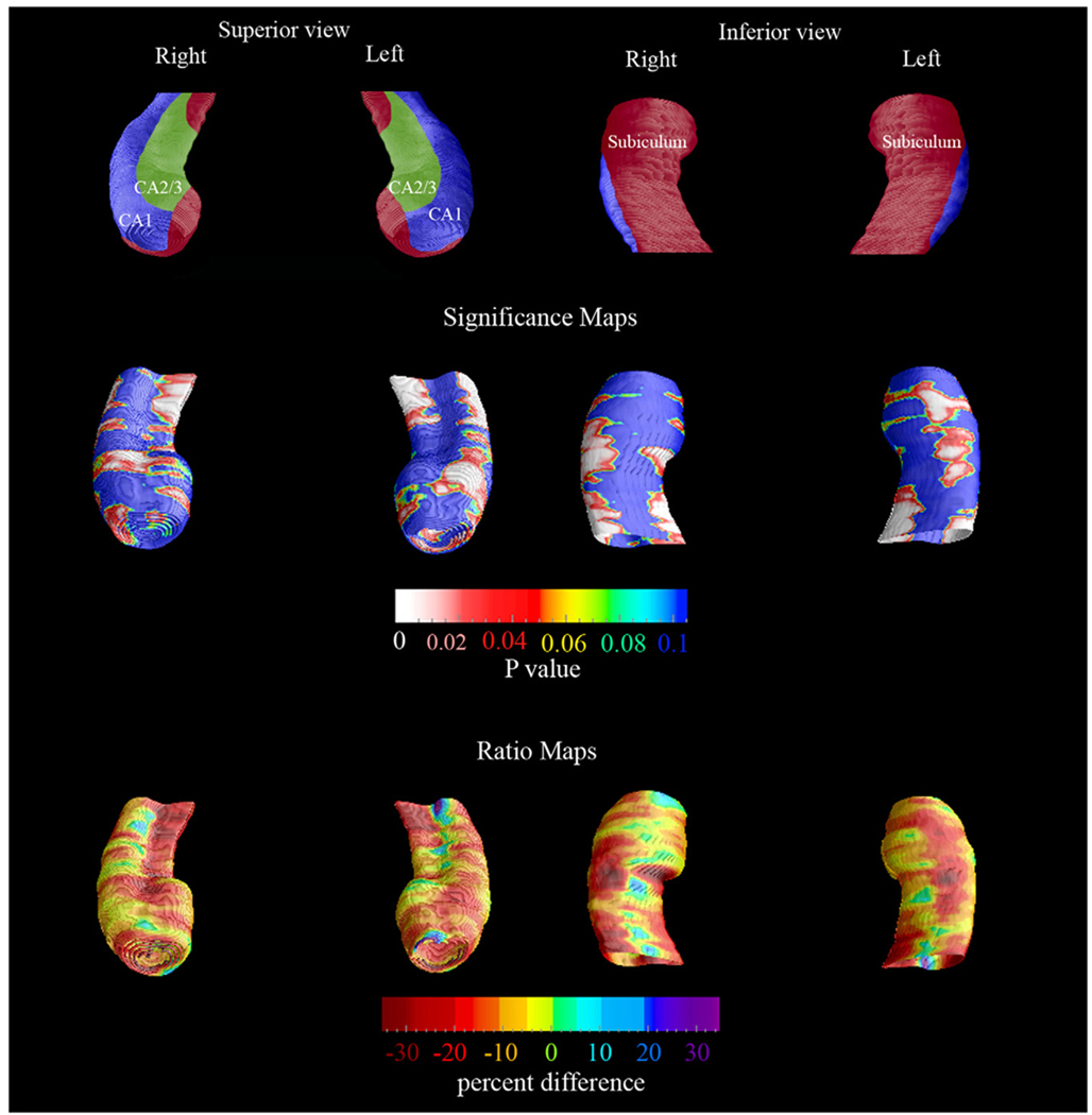
Fig. 2.
Follow-up 3-D comparison maps of the NL-NL and the NL-MCIAD groups. The significance maps show regions with significantly more atrophy in the NL-MCIAD group at follow-up (middle row). The ratio maps (bottom row) show the quantitative between-group differences (in %). The subfield definitions (top row) based on Duvernoy (1988) and West and Gundersen (1990). In the significance maps, dark blue colors denote p-values of 0.1 or higher.

