Figure 6.
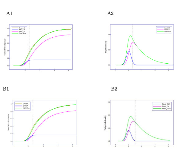
Results of applying the Weibull-normal mixture model to the neuroblastoma data sets - A and B show the favorable and unfavorable group, respectively. (A1, B1). Comparison between the fitted Weibull-normal distribution (green line) with two components ('On' and 'Off') and the empirical distribution (brown line). The pink line shows the component of expression intensities of 'On' genes, the blue line that of 'Off' genes. (A2, B2) Density function corresponding to the fitted Weibull-normal distribution function (green line) and its components (pink and blue lines).

