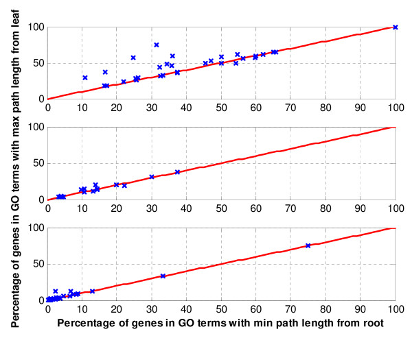
Figure 5.
Comparative analysis of the max path length from leaf (Strategy I) and the min path length from root (Strategy II) approaches in terms of percentage of genes in each GO category. Each row represents one of the three datasets: Saccharomyces cerevisiae amino acid starvation data, Saccharomyces cerevisiae cell cycle data, and Brassica napus data respectively. The y-axis represents the percentage of gene in a GO terms depicted using Strategy I (0, the most specific term by itself; no parent is considered). Likewise, the x-axis represents the percentages of genes in the same GO terms identified using Strategy II (3, a default in several tools). Points above the central diagonal line represent the GO terms with higher percentage of genes in Strategy I than Strategy II, whereas points below the line, the GO terms with higher percentage of genes identified using Strategy II. As can be seen, Strategy I has the largest number of GO terms with higher percentage of genes.

