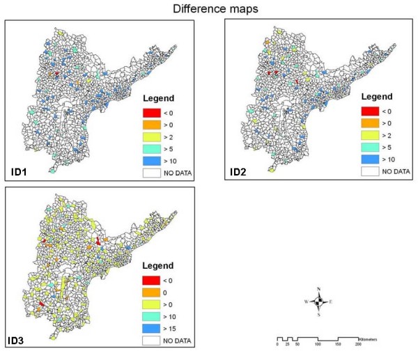
Figure 3.

diffs. Difference maps calculated to understand the population mobility in age groups 15-39. In ID1 and ID2 red mandals are the locations where IP >IREF and IP >IDW, blue mandals are those having exceptionally higher IDW and IREF. In ID3 Rrd mandals have IDW >IREF, orange mandals have IDW = IREF green mandals have IDW <IREF and blue mandals have IDW <<IREF. Blue mandals show the places where the lowest number of DWs gets tested.
