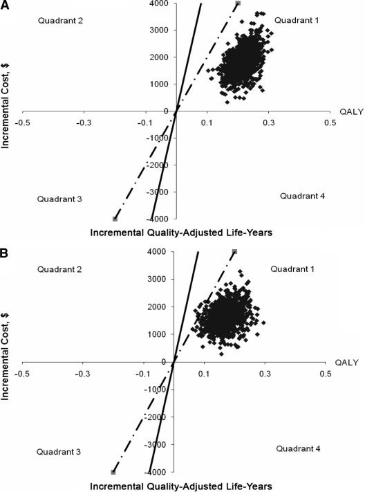
Figure 1.
Results of the probabilistic sensitivity analyses for the cost-effectiveness of aspirin use in newly diagnosed type 2 diabetes. A: Using parameters for general population in the ATT study. B: Using parameters for diabetes subgroup in the meta-analysis by De Berardis et al. (13). Plot of incremental cost versus incremental QALYs for aspirin use versus no aspirin use. Each dot on the graph represents one ICER from one of the 1,000 iterations. Solid line represents ICER = $50,000/QALY; dotted line represents ICER = $20,000/QALY. Dots on the right of the lines mean that the ICERS are less than the ICER the line represents. Dots in quadrant 1 show that the intervention is more effective and less costly; dots in quadrant 4 show that the intervention is cost saving.

