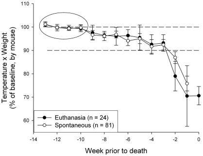
Figure 3.
Body weight and temperature in the last 14 wk of life, combining male and female mice. The panel represents the average of the calculated values of temperature × weight for each mouse. The circle highlights values that were averaged to generate the 100% value for each mouse, represented by the upper horizontal dashed line. In the last 2 wk of life, values fell to below 90% of the 100% benchmark (indicated as the lower dashed line).

