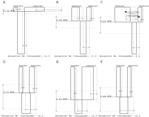
FIG. 2.
Histories for all six population pairs are represented as boxes (for sampled and ancestral populations), horizontal lines (for splitting times) and curved arrows (for migration). Time is represented on the vertical axis in each figure, with the sampled species and subspecies names given at the top of each figure at the most recent time point. (A–C) Comparisons among common chimpanzee subspecies, with a common scaling of the vertical axis for splitting time comparisons. (D–F) Comparisons between the bonobo and common chimpanzee populations with a common scaling of the vertical axis for splitting time comparisons. For all figures, the 95% highest posterior density intervals are shown with arrows in gray for population sizes (i.e., box widths) and splitting times (dotted lines). Migration arrows represent the population migration rate (i.e., 2NM) from the source population to the receiving population (i.e., forward in time). Only those population migration rates that were found to be statistically significant using a likelihood-ratio test are shown in which case the estimated value of 2NM is given as well as the significance level. Asterisks identify curves that are statistically significant by the test of Nielsen and Wakeley (2001): *P < 0.05; **P < 0.01, and ***P < 0.001.

