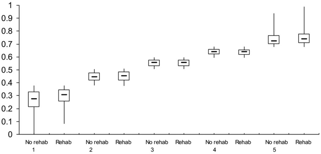
Fig 3.
A nonparametric illustration of the distribution of propensity for treatment comparing the no evidence of rehabilitation group to the acute rehabilitation group stratified by propensity quintile. The distributions are shown through a boxplot comparing those who received and did not receive inpatient rehabilitation by propensity quintile. The upper inner and lower horizontal lines are the 75th, 50th, and 25th percentiles, respectively. The lower and upper tips of the vertical lines represent the minimum and maximum values of propensity, respectively.

