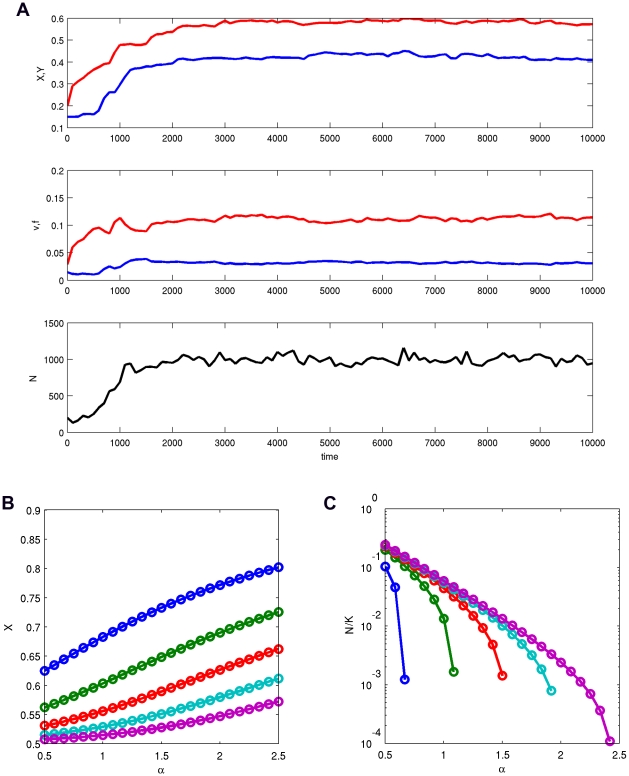
Figure 1. Evolution in major loci.
(A) An example of the model's dynamics with  . Shown are at top: the average values of
  (red) and
  (blue), middle: the average fertility
  (red) and viability
  (blue), and bottom: the number of colonies
  in the system. (B) The equilibrium values of
  for different
  and
and  (blue),8, 16, 32 and 64 (pink).
  , so that
  . (C) The relative equilibrium population size
  for the same values of parameters as in (b).

