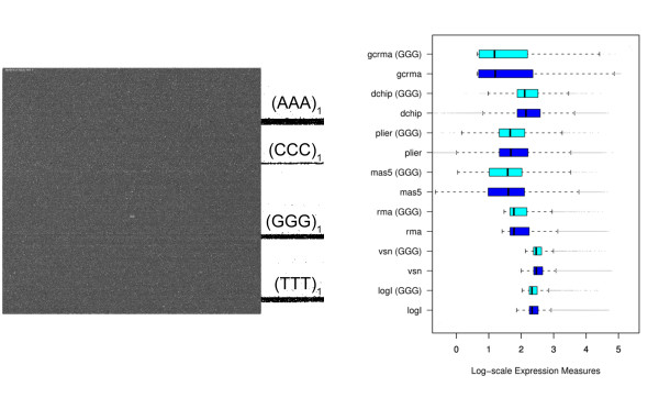
Figure 13.
The figure shows the same data as in Fig. 1 after sensitivity correction using the NN+GGG model. (a) Pseudo image of the chip calculated from the cel-file of corrected intensities. The bright stripes seen in Fig. 1a disappeared. (b) Boxplots of expression measures obtained from the pre-corrected intensities. The GGG-bias essentially vanishes after correction (compare with Fig. 1).

