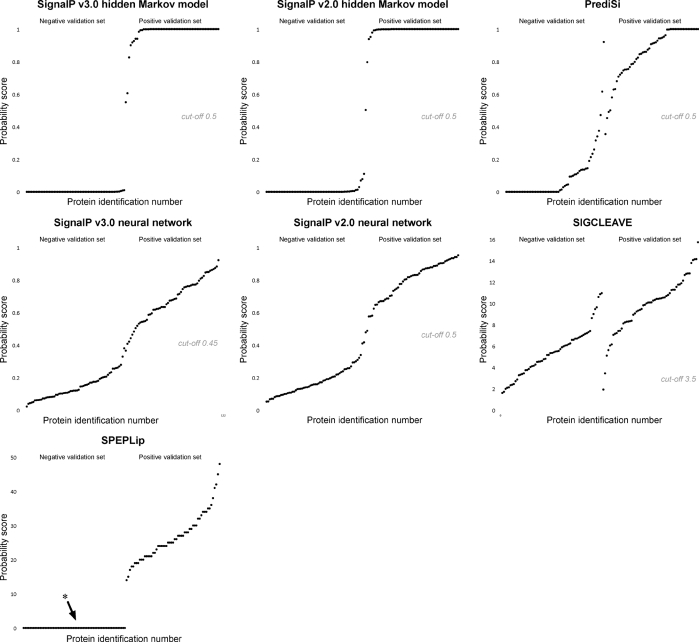
Fig. 1.
Scatter diagrams of signal peptide probability scores: the negative set is displayed on the left-hand half of the x axis, and the positive set on the right-hand half. The values from each set are sorted in increasing order by their acquired probability scores. Ideally, the scores should appear in separate ranges without overlap. The asterisk shows that the SPEPLip program does not output scores for proteins with a negative signal peptide prediction, and these proteins have therefore been given a minimum score (0), in order to plot them on the diagram.

