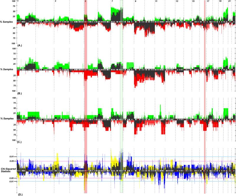
Figure 2.
Genomic frequency plot depicting the copy number alteration frequency of aberrations for (A) BRAF*, (B) NRAS* and (C) BRAF/NRAS wt/wt cell lines and tumors. Cell lines, gains (plotted in green) and losses (red) generally had higher alteration frequencies than did primary tumors (dark needles). (D) A chi-squared statistic for tumors (blue) and cell lines (yellow; overlap plotted in dark shade) identifies regions differentiating mutation groups. Those P-values above the ideogram represent regions of gain, while those below represent regions of loss. The regions that demonstrate the best concordance between cell lines and tumors include gains of 7q32.1-36.3 (shaded green) and gain of 5p15.33-31 (shaded red).

