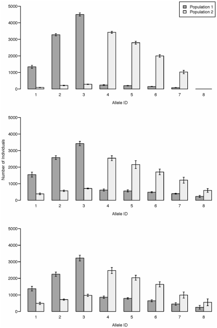
Figure 4. Simulation output with varying selection strengths.
Bar heights are the mean allele counts averaged over 10 simulations, and error bars denote one standard deviation. Simulations were run for 1000 generations with 10,000 individuals in each population. All alleles were initially present at equal frequencies.  in all plots and recombination occurred freely between all loci. Selection strengths were, in the top plot:
  and
and  , in the middle plot:
  and
and  , and in the bottom plot:
  and
and  .
.

