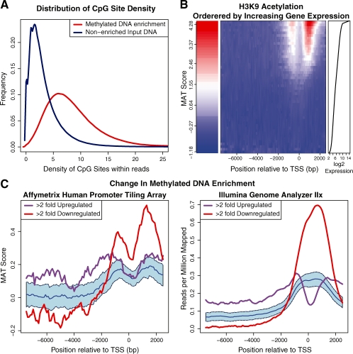
Fig. 1.
Repitools visualization examples. (A) In cpgDensityPlot, each line is a single experiment's read distribution in terms of CpG density. (B) For binPlots, the middle panel displays a heatmap of summarized signal according to 50 expression level bins (rows), organized into 100 bp locations (columns) within promoters. The left panel gives the enrichment colour scale and the right panel displays the gene expression for each bin. (C) For significancePlots, the purple and red lines illustrate the median signal for the gene sets of interest. The blue line represents median signal of all remaining genes in the genome, while the blue shading illustrates a 95% confidence interval (example data taken from Coolen et al. (2010).

