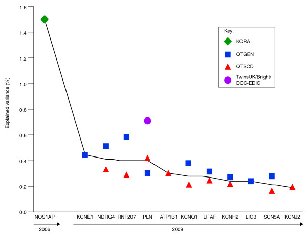
Figure 2.
Explained variance per risk gene for prolonging the QTc interval. The explained variance per risk gene is ordered along the x-axis according to year of discovery and decreasing explained variance. The green diamond represents the finding in the KORA cohort [23] (nGWA = 186, nGWA+replication = 6,612), the blue squares represent the findings of the QTGEN study [25] (n = 13,685), the red triangles those from the QTSCD study [26] (n = 15,854), and the orange circle the finding from the meta-analysis of the TwinsUK/Bright/DCCT-EDIC cohorts [24] (n = 3,558). GWA, genome-wide association.

