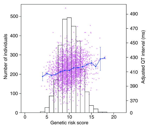
Figure 3.
Correlation between genetic risk score and QT interval. The bars show the distribution of the risk score classes (left axis). In pink, a plot of the risk score versus unstandardized QT residual is given, and the blue line shows the means of the unstandardized QT residual within risk score classes (right axis). Error bars represent the standard errors of the means.

