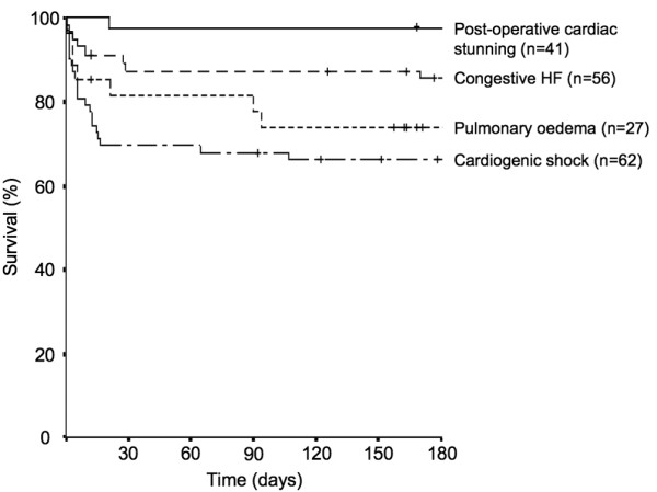
Figure 1.

Kaplan Meier curves showing survival rates of ICU patients with different acute heart failure (HF) syndromes over time, starting at the day of ICU admission. The small vertical lines indicate the time points when patients had their last follow-up. The survival curves between the groups are significantly different (log rank P < 0.001). Data were derived from [10].
