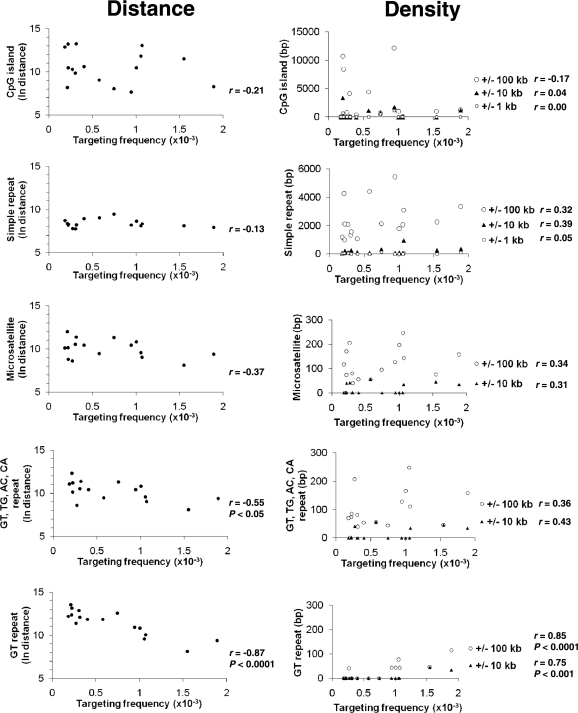
Figure 4.
Effects of neighboring genetic elements on gene targeting. In each panel, scatter plots on the left graph the targeting frequency at each target site and the natural logarithm of the distance from bp 37 of the neo gene in each target to the center of the indicated genetic element. Scatter plots on the right graph the density (total number of base pairs covered) of each genomic element within 100 kb (open circle), 10 kb (filled triangle) or 1 kb (open square) on either side of each target locus integration site. The lack of density values within ±1 kb in some panels is due to the absence of the respective genomic element in that interval. Correlation coefficients (r) and P-values (for significant r) are to the right of the scatter plots.

